Om & Away
Although somewhat established in the western countries, Wellness Travel was new to Singapore. Depending on a particular listing’s offering, customers needed to understand what they were buying—some packages included accommodation and meals alongside wellness activities while others did not.
This made it challenging as to how we might propose to structure the digital experience in order to start new users on their journey.
Om & Away (O&A) is an emerging Wellness Travel company. Wellness Travel is generally defined as travelling for the purpose of health and well-being through physical, psychological, and/or spiritual activities.

Sell experiences, not just places
The O&A site was initially designed to sell listings via destinations or activity this was displayed in a magazine-like format. It assumed that individuals looking for either would consider a holiday based on those primary needs by reading further into that listing. As we began our research and close partnership with O&A, we discovered that perhaps customers looking for an experience might also be looking for listings that were “detoxifying”, “restorative” or “healing”. This insight helped shape the way in which we would structure the home page and design its interface.

Through a series of workshops we conducted with O&A, we identified the groups of users that come to the site. From there we began to profile and understand their habits. Through these exchanges, we gain insights into the growing industry of Wellness Travel and learnt that mobile viewership is where conversions happen (it didn’t help that their website was not mobile responsive at that time).
People browse for holidays on dreary weekdays
Our research and studies with O&A also indicated that the target audiences largely looked for getaways and experiences on their mobile phones during weekday commuting hours (e.g. possibly on the subway or bus). Like many of our other projects, we started structuring upwards in screen sizes, always emphasising a mobile-first approach. People are looking for a holiday every day that isn't their holiday.
Price speaks volumes
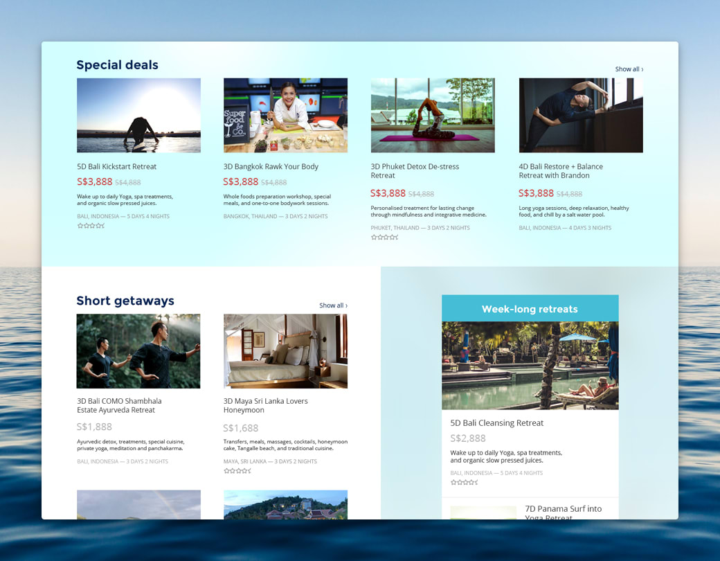
As a first time user to the site, I may wonder why listings for longer periods cost hundreds of dollars are next to shorter getaways that cost thousands. While it might be apparent to assume we should sort sort listings by their prices, we saw an opportunity to use this price difference to as a way to suggest what might and might not be included in a given listing.

In addition, we also proposed a guideline as to how the O&A team should title their listings. Our approach suggested that they include key phrases such as “5N” or “5 Nights” to indicate length of a listing, and also phrases that suggest the location and activity such as “Bali” and “Yoga”. Ultimately, titling their listings in this manner allowed their content to be more indexable and searchable.
Wellness Travel can be for everyone
We proposed that the new website needed to be speak to different groups of users who were at different phases of the sales process. These groups included: New leads that had some idea what wellness travel is, new leads who had no idea what wellness travel is, leads that came through word-of-mouth looking for offerings, returning customers who had used the old site, press and media agencies looking to cover a story, and finally new investors looking to invest in an emerging company.
A more browsable, bookable visual aesthetic
As O&A’s website looked more like a blog, we proposed to make it more like a travel booking site, emulating more conventional booking interfaces like AirBnB or Bookings.com.
